Tuesday 8 March 2016

Poster analysis


The first TV series poster I am going to analyze is Season one, American Horror story. The genre of this poster is horror, indicated in the title, with elements of drama and thriller. The characters are exposed through a hole in the wall which reveals how the series is likely to contain sinister aspects; this is also an example of an enigma code as we question their location.

The dominant signifier on the poster is the three main protagonists who it is assumed are a family. Each of the characters has a direct mode of address and has serious facial expressions. The female character, who is standing, is wearing a red dress which has connotations of danger and passion: this leads the audience to assume that there is going to be a strong representation of femininity present in the text.

The title used is of a feminine font, coloured white which has connotations of purity and innocence. However, the text below ‘Starts tonight 10pm’ takes a different approach: it uses uppercase and is a masculine font which is coloured red: again symbolising danger. Due to the contrast between the two texts the audience may assume there is also a contrast between each characters storyline. On the bottom right-hand corner there is a 3D indication of what channel the TV series will be broadcasted on: this again contains the colour scheme red and white and the contrasting connotations of danger and purity.

At the top of the mise en scene there is text which informs the audience of the creators of the TV series: viewers who have previously enjoyed media such as Glee and Nip/Tuck may be persuaded to watch. It can be said that this information reveals the genre of the poster. 


The second example of a TV series poster I am going to analyse is ‘Suits.’ The genre of this poster is presumably a legal drama: the audience can assume this due to the dress code of the main protagonists who are wearing suits. The location of the two men appears to be a city where from our intertextual knowledge this genre is often present.

The dominant signifiers are clearly the two male characters who are also likely to be the main protagonists. Both have a direct mode of address and formal but relaxed facial expressions.
The colour scheme used on the TV poster is black, white and red. Each of these colours contrasts with each other: black having connotations of authority, elegance and formality whereas white symbolises purity, innocence and isolation. Red has the connotations of passion and danger in which the audience can assume each of these representations are present in the text.

The two protagonists have different dress codes: The man on the left is wearing red informal converse and a red tie which is misplaced whereas on the right the man is wearing black, polished office shoes and a buttoned blazer. The contrast between the two characters symbolises there is perhaps two sides to a story and the conflict between the characters.

The title used is written in a masculine red block font which is designed to portray how this TV series is aimed at men. The mise en scene also contains a slogan ‘Nothing’s ever black and white’ which is ironic as the poster uses these as the main colours. 


'Lie to me’ is another example of a TV series poster which contains elements of the genres drama, crime fiction and thriller. This is indicated in the title as well as the background images of human eyes and mouths which we can use to detect when someone is lying.

The dominant signifier on this TV poster is the man who is closest to the camera: due to his authoritative position the audience may assume he is also the main protagonist. Each of the characters present on the poster has a direct mode of address and has a relatively serious facial expression which indicates the formality of the series. Each of the characters on the poster has a formal dress code such as a suit and tie to show the audience the importance.

The poster is aimed at both women and men as there are characters from both genres which are represented as strong and powerful. The women on the poster may also be described as the male gaze who encourages men to watch as well as women who view them as role models.

The title uses the colours red and white which has conations of danger and passion and purity and innocence. As well as this, the poster contains the by-line ‘they’re undeceivable’ to represent how each character is free from illusion.   

Tuesday 1 March 2016

DVD design ideas


DVD analyis


The DVD cover I am analysing is season one, Orphan Black. The genre of this cover appears to be science fiction and perhaps with an element of mystery: I assume this as the dominant signifier is broken down into sections of different characters as if it is a puzzle. The main image on the front cover is made up by mostly using extreme close up shots of the characters face which have a direct mode of address. On the bottom left hand corner is a photograph of a character who looks shocked and questioning which may relate to the genre of the TV series. We are made aware that the genre of this TV series is also an action thriller which is stated in the synopsis: the photograph on the back is of a character wearing black, which has connotations of power and mystery, is attempting to run away or after someone.
The target audience for this TV Series is presumably aimed at middle aged women – the characters on the front are female which suggest that a feminine audience would be interested and find it easier to relate to. The actresses’ name, Tatiana Maslany, is displayed at the top of the DVD cover to inform the audience but also to encourage people to watch. The target audience will possibly be familiar with this actress and view her as a positive representation of women. Tatiana Maslany has featured in several other TV series which the target audience may be familiar with such as ‘The Vow’ and ‘The woman in gold.’
The text used on the front cover is white and turquoise.  The connotations are that these are colours that are linked to female characteristics such as innocence and jealously.  This is further reinforced with the choice of font which is thin, almost fragile but is in capitals which may connote the strength of the character.    The characters personalities may also reflect the style of the font: some of the women appear vulnerable and others strong and powerful.
The back cover displays several screenshots of scenes taken from the series which will help the audience to decide if they will proceed to watch Orphan Black. The bottom left screenshot displays a wall with a red question mark painted on it: red is an index of danger and this also represents the genre of mystery as we begin to question the purpose of this photograph. The young girl photographed on the bottom light is captured hiding behind a wall – this again reflects the genre of the series as mystery. The audience may also assume that Orphan Black contains scenes of romance as two screenshots portray an intimate scene.
In these screenshots there are many different representations of women which the TV series will likely explore. The top left image shows a woman who is behaving submissively: she is allowing the male character to guide her by placing his hand on her back to show his dominance. This is a contrast to the top right image of a female character who is wearing a black, leather bomber jacket who appears in control and rebellious. To the left hand side of this image is a scene of a woman who seems to be caring for a younger male character: she is placed in a domestic setting which is how women were traditionally viewed. The final representation of women showed on the back cover is a scene of a woman who is in love, however, it is important to notice she is the dominant figure which we know because of her position – she is closer and higher up to the camera angle.

The back of the DVD cover displays a quote which idolises the main actress Tatiana Maslany.  This is a quote by Entertainment Daily which is a popular website used by the target audience: this is therefore encouraging people to watch. Another selling point which the cover contains is the BBC logo to inform that the series will be played on this particular channel: BBC is a well-known and popular channel which will persuade the target audience to watch. This DVD cover also informs that it contains special features such as an interview with the main actress in which fans of her will be encouraged to watch.


The DVD cover I am analysing is season one, Orange is the new black. The genre of this DVD cover is a comedy-drama. The audience knows this as they are informed on the back cover that the creator of ‘Weeds’ has also produced this series. The target audience for Orange is the new black is adults aged eighteen to thirty: the content in the series is sexually explicit and contains adult humour. More specifically the TV series is aimed at women as the plot is based in a women’s prison and there are significantly more female characters. As well as this, people who are attracted to actresses such as Taylor Schilling may be encouraged to watch as she is the male gaze.
 The main protagonist is the character Piper Chapman who is also the dominant signifier: the prison uniform she is wearing represents that she is an outcast and isolated because she is new. The characters in the background are seen to be relaxed as their outfits are informal. The actress who plays Piper Chapman has a serious facial expression and a direct mode of address which is ironic as the series is humorous. It is apparent that the main protagonist contrasts against the colourless and dull background which reveals aspects of her personality and foreshadows the plot.
The text used on the front cover is coloured black and red which uses a distorted feminine font. The colour black is associated with power, elegance and formality whereas the colour red has connotations of danger and passion. The tagline uses a metaphor ‘every sentence is a story’ which implies that every character will be unique and have their own series of events.
On the back cover are several character profiles who feature in the first season: this is designed to introduce the audience to the characters and encourage them to watch as they contain aspects of comedy and the male gaze: for example, ‘crazy eyes.’ Above the screenshots of character profiles is a quotation taken from a trusted source ‘San Francisco Chronicle’ and therefore a mark of quality. This is a unique selling point as the audience are told this series is a ‘New definition of television excellence.’
On the bottom of the back cover is the technical information which informs the audience of the episode duration, the subtitles available and the year it was released. 


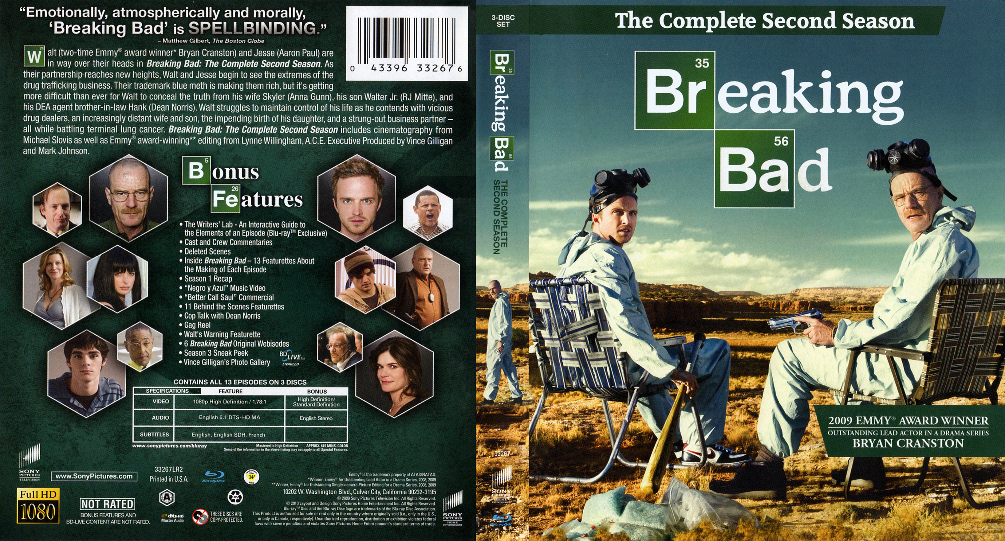
                 The TV Series DVD cover I am analysing is season two, Breaking Bad. The genre of the DVD cover contains elements of comedy and crime. This is portrayed by the two main protagonists as they are displaying a comical facial expression and their dress code is made up of unusual laboratory equipment. The dominant signifier on the right hand side is portrayed as the more authoritative figure as he is positioned closer to the camera. As well as this, he is holding a prop in the form of a gun which reveals the crime-thriller genre.
The target audience for the DVD cover Breaking Bad is aimed at young adults between the ages of eighteen to thirty as the mature content involving drug use and weapons would not appeal to children. More specifically, the DVD cover is aimed at men are there is a lack of female figures which would not entice female viewers.
The front cover contains several enigma codes which encourage the audience to question to direction of the prop and the location the characters are in. The font is made up of chemical element symbols which portrays the scientific theme of the show which is perhaps illegal science due to the use of the gun and deserted location. Following on from the element symbols the font is printed in curved white text which shows the cover is informal and relaxed. The front cover also contains a banner informing the audience of the 2009 Emmy Award given to Bryan Cranston who is the main protagonist.
On the back of the DVD cover is a positive quote taken from a trusted source ‘Matthew Gilbert, The Boston Globe’ which is a mark of quality as the audience may be familiar with this newspaper. There are several snapshots of the characters face in the form of a hexagon using a close up shot which will familiarise and introduce the audience to these.  The DVD cover also contains ‘bonus features’ a unique selling point which will encourage the audience to buy the TV series. 

Poster design ideas